Back to work
Packaging system
Mira Skincare
A calm packaging system for a growing skincare range — clinical clarity with a softer, human touch.
Packaging
Identity
Retail
Client
Mira Skincare
Year
2024
Role
Packaging designer

01 — Overview
Gentle on the shelf, clear in the hand.
Mira was growing from four products to twenty. Their packaging had been designed one product at a time and no longer felt like a family.
We rebuilt the system from the label up, so new products slot in without a redesign.

Deliverables
Packaging system
Label architecture
Retail display
02 — Challenge
Twenty products, one family.
Customers struggled to tell serums from cleansers at a glance, and each launch meant reinventing the label. The range needed structure without losing its warmth.

Category clutter

The previous range
03 — Approach
We designed the information first — what a customer needs to read in two seconds — then let material and colour carry the mood.
Map the range
Grouped every product by routine step and skin need to find a clear hierarchy.

Design the label
A fixed label architecture with a single variable colour band for each step.

Material tests
Frosted and matte finishes tested in store lighting before final production.

04 — Solution
A range that reads at a glance.
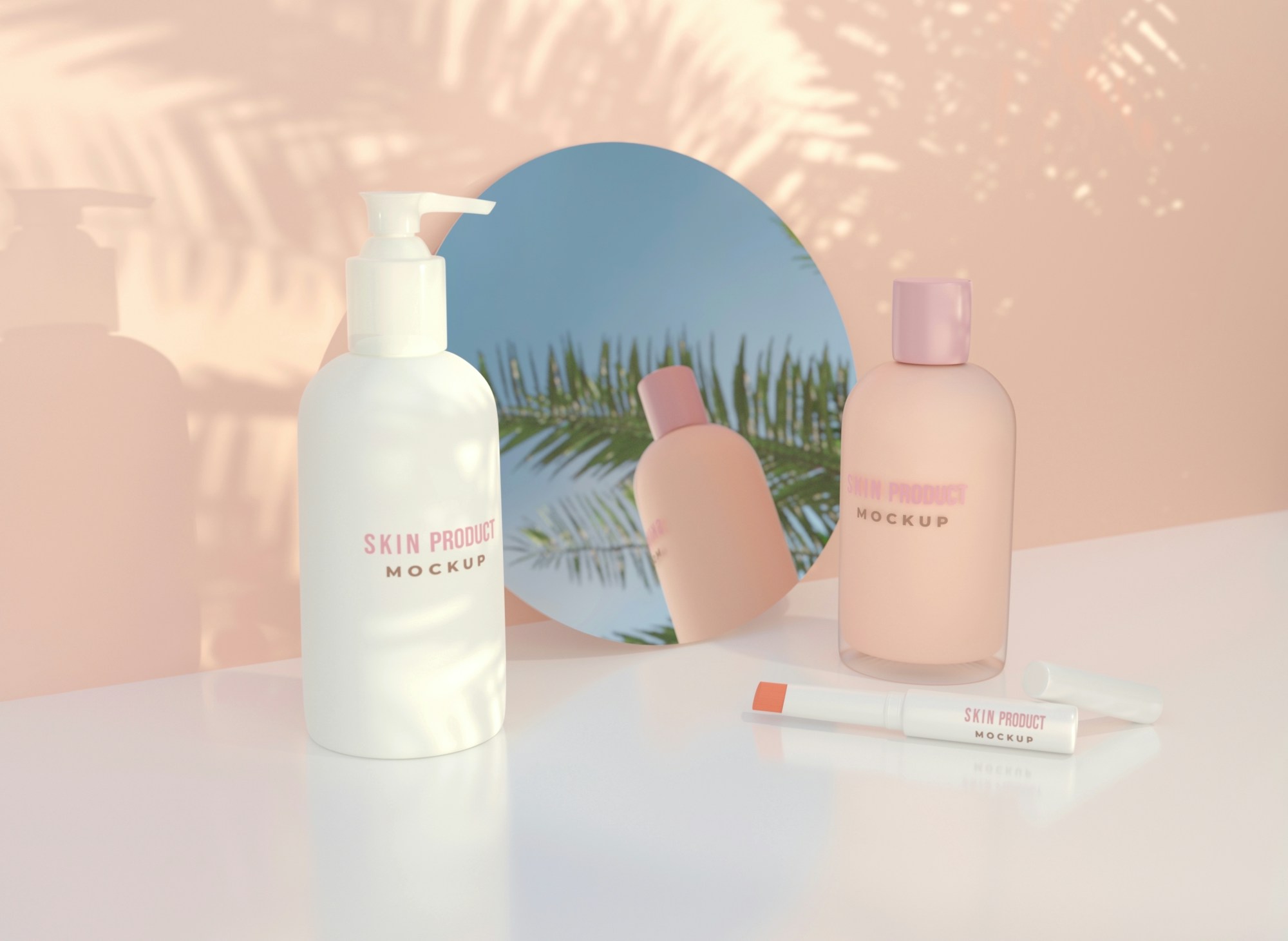
A label system with a clear reading order, a soft neutral palette and finishes that feel considered in the hand.




05 — Results
Every product now follows the same reading order, so customers find the right step of their routine at a glance. New launches slot into the system with a colour band and a name — no new label design needed.
20
products on one label architecture
5
routine steps, each with its own colour band
Calm, sharp and quietly relentless about detail. The packaging system still scales with every new product we launch.
Leo Martens
Brand lead, Mira Skincare
Next project
